Stats, cards
Install
npx shadcn add @klarhimmel/stats-cardsUsage
import { Theme } from '@/components/klarhimmel/theme/style';
import { BlockSurface } from '@/components/klarhimmel/blocks/surface';
import StatsCards from '@/components/klarhimmel/blocks/stats-cards';

export default function Section() {
  return (
    <Theme theme="brand">
      <BlockSurface>
        <StatsCards props={{
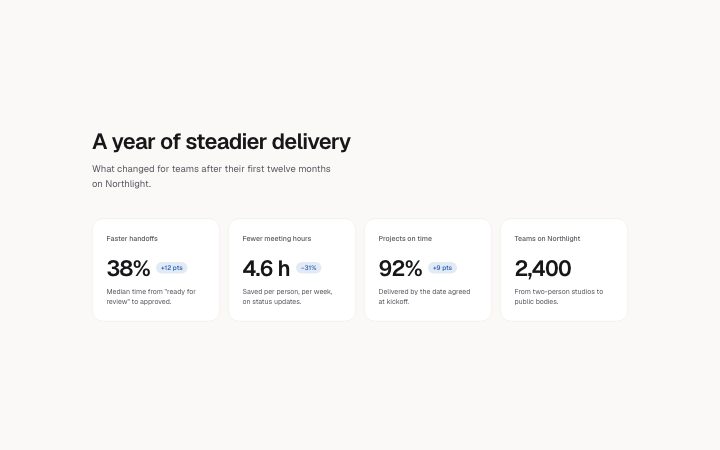
          "title": "A year of steadier delivery",
          "description": "What changed for teams after their first twelve months on Northlight.",
          "items": [
            {
              "value": "38%",
              "label": "Faster handoffs",
              "description": "Median time from \"ready for review\" to approved.",
              "delta": "+12 pts"
            },
            {
              "value": "4.6 h",
              "label": "Fewer meeting hours",
              "description": "Saved per person, per week, on status updates.",
              "delta": "−31%"
            },
            {
              "value": "92%",
              "label": "Projects on time",
              "description": "Delivered by the date agreed at kickoff.",
              "delta": "+9 pts"
            },
            {
              "value": "2,400",
              "label": "Teams on Northlight",
              "description": "From two-person studios to public bodies.",
              "delta": ""
            }
          ]
        }} />
      </BlockSurface>
    </Theme>
  );
}
Install
Import
import Block from '@/components/klarhimmel/blocks/stats-cards';- stats/cards
- Category
- A few numbers that prove the point.
Notes
When to use it
Two to four stat cards, each with a large value, a label, a line of context and an optional change badge. Pick it for dashboard-like facts; `stats-row` is lighter when there is no context line.
Writing for it
- The value holds only 16 characters, so '1,2 M' fits and '1,2 million users' does not. Put the unit in the label (40 characters). - The delta field (32 characters) turns into a small accent badge such as '+12%' or 'up 3 pts'. Leave it empty on cards where nothing changed, and no badge is drawn. - The description line has 160 characters, a good place for the comparison period so nobody has to guess what the badge is relative to.
Watch out for
There is no eyebrow in this block, only title and description. Count the cards before you design around it, since two cards sit in two columns and three or four spread across a row only on wider containers.
Pairs well with
Usage
The block in a page, with its default content (long lists shortened). Every prop is in the table below.
import { Theme } from '@/components/klarhimmel/theme/style';
import { BlockSurface } from '@/components/klarhimmel/blocks/surface';
import StatsCards from '@/components/klarhimmel/blocks/stats-cards';

export default function Section() {
  return (
    <Theme theme="brand">
      <BlockSurface>
        <StatsCards props={{
          "title": "A year of steadier delivery",
          "description": "What changed for teams after their first twelve months on Northlight.",
          "items": [
            {
              "value": "38%",
              "label": "Faster handoffs",
              "description": "Median time from \"ready for review\" to approved.",
              "delta": "+12 pts"
            },
            {
              "value": "4.6 h",
              "label": "Fewer meeting hours",
              "description": "Saved per person, per week, on status updates.",
              "delta": "−31%"
            },
            {
              "value": "92%",
              "label": "Projects on time",
              "description": "Delivered by the date agreed at kickoff.",
              "delta": "+9 pts"
            },
            {
              "value": "2,400",
              "label": "Teams on Northlight",
              "description": "From two-person studios to public bodies.",
              "delta": ""
            }
          ]
        }} />
      </BlockSurface>
    </Theme>
  );
}
Props
The type, default and text limit of every prop. On a real page, over-limit text is kept and checkSections flags it (Installation, Check a page before you ship); this live preview shows the default until it fits. The panel above edits all props.
| Prop | Type | Default | Description |
|---|---|---|---|
title | string | 'A year of steadier delivery' | Text, up to 120 characters. |
description | string | 'What changed for teams after their …' | Text, up to 300 characters. |
items | { value, label, description, delta }[] | 4 items | List of 2 to 4. Each item: value, label, description, delta. |
headingLevel | '1' | '2' | - | One of '1', '2'. Optional; empty is not rendered. |