Stats, split
Install
npx shadcn add @klarhimmel/stats-splitUsage
import { Theme } from '@/components/klarhimmel/theme/style';
import { BlockSurface } from '@/components/klarhimmel/blocks/surface';
import StatsSplit from '@/components/klarhimmel/blocks/stats-split';

export default function Section() {
  return (
    <Theme theme="brand">
      <BlockSurface>
        <StatsSplit props={{
          "eyebrow": "Results",
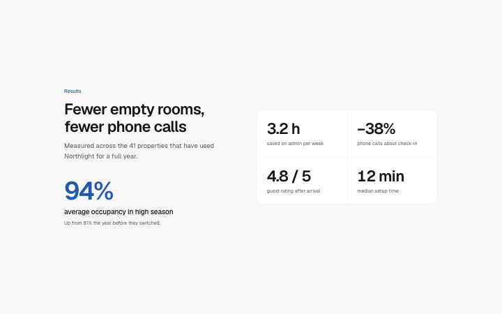
          "title": "Fewer empty rooms, fewer phone calls",
          "description": "Measured across the 41 properties that have used Northlight for a full year.",
          "highlight": {
            "value": "94%",
            "label": "average occupancy in high season",
            "note": "Up from 81% the year before they switched."
          },
          "items": [
            {
              "value": "3.2 h",
              "label": "saved on admin per week"
            },
            {
              "value": "−38%",
              "label": "phone calls about check-in"
            },
            {
              "value": "4.8 / 5",
              "label": "guest rating after arrival"
            },
            {
              "value": "12 min",
              "label": "median setup time"
            }
          ]
        }} />
      </BlockSurface>
    </Theme>
  );
}
Install
Import
import Block from '@/components/klarhimmel/blocks/stats-split';- stats/split
- Category
- A few numbers that prove the point.
Notes
When to use it
A heading and one oversized headline figure on the left, with two to four supporting numbers on the right. Use it when one number matters more than the rest; `stats-row` is the version where all are equal.
Writing for it
- The highlight value holds 20 characters and is drawn at display size in the accent colour. Choose the one number you would say out loud first. - The highlight note (160 characters) is optional and good for the source or time frame of that figure. - The supporting items take a 20 character value and an 80 character label each, and two to four fit in a two-column grid.
Watch out for
The highlight is not repeated in the item list, so do not put the same number in both. With an odd number of supporting items the grid on the right has one empty cell.
Pairs well with
Usage
The block in a page, with its default content (long lists shortened). Every prop is in the table below.
import { Theme } from '@/components/klarhimmel/theme/style';
import { BlockSurface } from '@/components/klarhimmel/blocks/surface';
import StatsSplit from '@/components/klarhimmel/blocks/stats-split';

export default function Section() {
  return (
    <Theme theme="brand">
      <BlockSurface>
        <StatsSplit props={{
          "eyebrow": "Results",
          "title": "Fewer empty rooms, fewer phone calls",
          "description": "Measured across the 41 properties that have used Northlight for a full year.",
          "highlight": {
            "value": "94%",
            "label": "average occupancy in high season",
            "note": "Up from 81% the year before they switched."
          },
          "items": [
            {
              "value": "3.2 h",
              "label": "saved on admin per week"
            },
            {
              "value": "−38%",
              "label": "phone calls about check-in"
            },
            {
              "value": "4.8 / 5",
              "label": "guest rating after arrival"
            },
            {
              "value": "12 min",
              "label": "median setup time"
            }
          ]
        }} />
      </BlockSurface>
    </Theme>
  );
}
Props
The type, default and text limit of every prop. On a real page, over-limit text is kept and checkSections flags it (Installation, Check a page before you ship); this live preview shows the default until it fits. The panel above edits all props.
| Prop | Type | Default | Description |
|---|---|---|---|
eyebrow | string | 'Results' | Text, up to 60 characters. |
title | string | 'Fewer empty rooms, fewer phone calls' | Text, up to 120 characters. |
description | string | 'Measured across the 41 properties t…' | Text, up to 300 characters. |
highlight | { value, label, note } | {…} | Fields: value, label, note. |
items | { value, label }[] | 4 items | List of 2 to 4. Each item: value, label. |
headingLevel | '1' | '2' | - | One of '1', '2'. Optional; empty is not rendered. |