Stats, bars
Install
npx shadcn add @klarhimmel/stats-barsUsage
import { Theme } from '@/components/klarhimmel/theme/style';
import { BlockSurface } from '@/components/klarhimmel/blocks/surface';
import StatsBars from '@/components/klarhimmel/blocks/stats-bars';

export default function Section() {
  return (
    <Theme theme="brand">
      <BlockSurface>
        <StatsBars props={{
          "eyebrow": "The numbers",
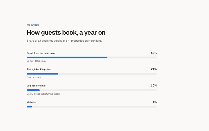
          "title": "How guests book, a year on",
          "description": "Share of all bookings across the 41 properties on Northlight.",
          "items": [
            {
              "label": "Direct from the hotel page",
              "value": "62%",
              "note": "Up from 38% before."
            },
            {
              "label": "Through booking sites",
              "value": "24%",
              "note": "Down from 51%."
            },
            {
              "label": "By phone or email",
              "value": "10%",
              "note": "Mostly groups and returning guests."
            },
            {
              "label": "Walk-ins",
              "value": "4%",
              "note": ""
            }
          ]
        }} />
      </BlockSurface>
    </Theme>
  );
}
Install
Import
import Block from '@/components/klarhimmel/blocks/stats-bars';- stats/bars
- About
- Two to six measures as labelled horizontal bars with the value at the end. The bar length is the number in `value` (0 to 100, any step: 4% draws 4%; the old `fill` prop is ignored); use it for shares and rates, not for raw counts.
- Category
- A few numbers that prove the point.
Notes
When to use it
Two to six measures as labelled horizontal bars, for shares and rates such as satisfaction or uptime. Use `stats-rings` for a few percentages as circles, and `stats-row` for raw counts.
Writing for it
- The first number in value (20 characters) is the bar length from 0 to 100, so write '62%' or '4,5 %'. A value of '4.5' draws a bar of 4.5 percent. - Use the 100 character note under a bar to say how the number was measured, for instance the period and the sample. - Put the labels in a consistent order, such as largest first, because the bars are stacked with the same width and compare by eye.
Watch out for
A value with no number in it, like 'High', draws no bar at all, only the text. The old fill prop is ignored, so setting it does nothing.
Pairs well with
Usage
The block in a page, with its default content (long lists shortened). Every prop is in the table below.
import { Theme } from '@/components/klarhimmel/theme/style';
import { BlockSurface } from '@/components/klarhimmel/blocks/surface';
import StatsBars from '@/components/klarhimmel/blocks/stats-bars';

export default function Section() {
  return (
    <Theme theme="brand">
      <BlockSurface>
        <StatsBars props={{
          "eyebrow": "The numbers",
          "title": "How guests book, a year on",
          "description": "Share of all bookings across the 41 properties on Northlight.",
          "items": [
            {
              "label": "Direct from the hotel page",
              "value": "62%",
              "note": "Up from 38% before."
            },
            {
              "label": "Through booking sites",
              "value": "24%",
              "note": "Down from 51%."
            },
            {
              "label": "By phone or email",
              "value": "10%",
              "note": "Mostly groups and returning guests."
            },
            {
              "label": "Walk-ins",
              "value": "4%",
              "note": ""
            }
          ]
        }} />
      </BlockSurface>
    </Theme>
  );
}
Props
The type, default and text limit of every prop. On a real page, over-limit text is kept and checkSections flags it (Installation, Check a page before you ship); this live preview shows the default until it fits. The panel above edits all props.
| Prop | Type | Default | Description |
|---|---|---|---|
eyebrow | string | 'The numbers' | Text, up to 60 characters. |
title | string | 'How guests book, a year on' | Text, up to 120 characters. |
description | string | 'Share of all bookings across the 41…' | Text, up to 300 characters. |
items | { label, value, note }[] | 4 items | List of 2 to 6. Each item: label, value, note. |
headingLevel | '1' | '2' | - | One of '1', '2'. Optional; empty is not rendered. |