Team, featured
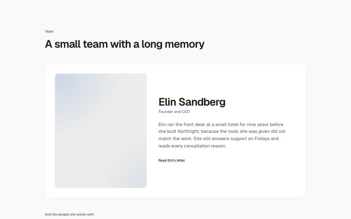
Install
npx shadcn add @klarhimmel/team-featuredUsage
import { Theme } from '@/components/klarhimmel/theme/style';
import { BlockSurface } from '@/components/klarhimmel/blocks/surface';
import TeamFeatured from '@/components/klarhimmel/blocks/team-featured';

export default function Section() {
  return (
    <Theme theme="brand">
      <BlockSurface>
        <TeamFeatured props={{
          "eyebrow": "Team",
          "title": "A small team with a long memory",
          "description": "",
          "lead": {
            "name": "Elin Sandberg",
            "role": "Founder and CEO",
            "bio": "Elin ran the front desk at a small hotel for nine years before she built Northlight, because the tools she was given did not match the work. She still answers support on Fridays and reads every cancellation reason.",
            "photo": {
              "src": "",
              "alt": "Portrait of Elin Sandberg"
            },
            "link": {
              "label": "Read Elin's letter",
              "href": "/letter"
            }
          },
          "membersTitle": "And the people she works with",
          "members": [
            {
              "name": "Oskar Wahl",
              "role": "Engineering",
              "photo": {
                "src": "",
                "alt": "Portrait of Oskar Wahl"
              }
            },
            {
              "name": "Priya Nair",
              "role": "Product",
              "photo": {
                "src": "",
                "alt": "Portrait of Priya Nair"
              }
            },
            {
              "name": "Leo Strand",
              "role": "Customer success",
              "photo": {
                "src": "",
                "alt": "Portrait of Leo Strand"
              }
            },
            {
              "name": "Maja Lund",
              "role": "Design",
              "photo": {
                "src": "",
                "alt": "Portrait of Maja Lund"
              }
            }
          ]
        }} />
      </BlockSurface>
    </Theme>
  );
}
Install
Import
import Block from '@/components/klarhimmel/blocks/team-featured';- team/featured
- Category
- The people behind it.
Notes
When to use it
Puts one person on the stage with a large portrait and a long bio, then shows everyone else as small round portraits. Pick it for founder-led companies; when no one outranks the rest, `team-grid` treats people equally.
Writing for it
- The lead bio holds 400 characters, enough for a paragraph with a reason to trust this person. Write what they did before the company, not a list of titles. - The lead gets a link of its own, for example a letter or an interview. Use a label that says what is behind it. - Add two to six other members, each with name, role and a square photo. The role is the only line under the name, so make it a team or a function.
Watch out for
The lead photo is cropped to a 4 by 5 frame and the others to squares shown as circles, so a wide group shot will lose people at the edges. Clearing membersTitle or the lead link label removes those lines.
Pairs well with
Usage
The block in a page, with its default content (long lists shortened). Every prop is in the table below.
import { Theme } from '@/components/klarhimmel/theme/style';
import { BlockSurface } from '@/components/klarhimmel/blocks/surface';
import TeamFeatured from '@/components/klarhimmel/blocks/team-featured';

export default function Section() {
  return (
    <Theme theme="brand">
      <BlockSurface>
        <TeamFeatured props={{
          "eyebrow": "Team",
          "title": "A small team with a long memory",
          "description": "",
          "lead": {
            "name": "Elin Sandberg",
            "role": "Founder and CEO",
            "bio": "Elin ran the front desk at a small hotel for nine years before she built Northlight, because the tools she was given did not match the work. She still answers support on Fridays and reads every cance…",
            "photo": {
              "src": "",
              "alt": "Portrait of Elin Sandberg"
            },
            "link": {
              "label": "Read Elin's letter",
              "href": "/letter"
            }
          },
          "membersTitle": "And the people she works with",
          "members": [
            {
              "name": "Oskar Wahl",
              "role": "Engineering",
              "photo": {
                "src": "",
                "alt": "Portrait of Oskar Wahl"
              }
            },
            {
              "name": "Priya Nair",
              "role": "Product",
              "photo": {
                "src": "",
                "alt": "Portrait of Priya Nair"
              }
            },
            {
              "name": "Leo Strand",
              "role": "Customer success",
              "photo": {
                "src": "",
                "alt": "Portrait of Leo Strand"
              }
            }
          ]
        }} />
      </BlockSurface>
    </Theme>
  );
}
Props
The type, default and text limit of every prop. On a real page, over-limit text is kept and checkSections flags it (Installation, Check a page before you ship); this live preview shows the default until it fits. The panel above edits all props.
| Prop | Type | Default | Description |
|---|---|---|---|
eyebrow | string | 'Team' | Text, up to 60 characters. |
title | string | 'A small team with a long memory' | Text, up to 120 characters. |
description | string | '' | Text, up to 300 characters. |
lead | { name, role, bio, photo, link } | {…} | Fields: name, role, bio, photo, link. |
membersTitle | string | 'And the people she works with' | Text, up to 60 characters. |
members | { name, role, photo }[] | 4 items | List of 2 to 6. Each item: name, role, photo. |
headingLevel | '1' | '2' | - | One of '1', '2'. Optional; empty is not rendered. |