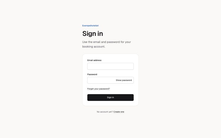
Sign in
Install
npx shadcn add @klarhimmel/app-auth-signinUsage
import { Theme } from '@/components/klarhimmel/theme/style';
import { BlockSurface } from '@/components/klarhimmel/blocks/surface';
import AppAuthSignin from '@/components/klarhimmel/blocks/app-auth-signin';

export default function Section() {
  return (
    <Theme theme="brand">
      <BlockSurface>
        <AppAuthSignin props={{
          "eyebrow": "Exempelhotellet",
          "title": "Sign in",
          "description": "Use the email and password for your booking account.",
          "emailLabel": "Email address",
          "passwordLabel": "Password",
          "showLabel": "Show password",
          "hideLabel": "Hide password",
          "forgot": {
            "label": "Forgot your password?",
            "href": "#reset"
          },
          "submit": "Sign in",
          "sending": "Signing in…",
          "alternative": {
            "text": "No account yet?",
            "link": {
              "label": "Create one",
              "href": "#sign-up"
            }
          },
          "state": "idle",
          "messages": {
            "error": "That email and password do not match. Check them and try again."
          }
        }} />
      </BlockSurface>
    </Theme>
  );
}
States
sign in in 3 forms: idle, sending, error.
state: idle
Exempelhotellet
Sign in
Use the email and password for your booking account.
No account yet? Create one
state: sending
Exempelhotellet
Sign in
Use the email and password for your booking account.
No account yet? Create one
state: error
Exempelhotellet
Sign in
Use the email and password for your booking account.
No account yet? Create one
Notes
When to use it
The standard email and password sign-in form. If the person has forgotten the password, `app-auth-reset` is the follow-up; for a new account use `app-auth-signup`.
Writing for it
- `emailLabel` and `passwordLabel` are required, 40 characters at most; write Email address and Password, not instructions, because they are the field names read aloud. - The password field has a show and hide button whose words come from `showLabel` and `hideLabel` (30 each). Make them different words, so the state is clear to someone not seeing the icon. - `alternative` pairs a question of up to 80 characters with a link, such as No account yet? and Create one, and sits under the form.
Watch out for
It never submits unless the host supplies an `action` or handles the submit. The error banner is not tied to a field: `messages.error` (160) must say what went wrong in general, because the fields are only described by that banner.
Pairs well with
Usage
The block in a page, with its default content (long lists shortened). Every prop is in the table below.
import { Theme } from '@/components/klarhimmel/theme/style';
import { BlockSurface } from '@/components/klarhimmel/blocks/surface';
import AppAuthSignin from '@/components/klarhimmel/blocks/app-auth-signin';

export default function Section() {
  return (
    <Theme theme="brand">
      <BlockSurface>
        <AppAuthSignin props={{
          "eyebrow": "Exempelhotellet",
          "title": "Sign in",
          "description": "Use the email and password for your booking account.",
          "emailLabel": "Email address",
          "passwordLabel": "Password",
          "showLabel": "Show password",
          "hideLabel": "Hide password",
          "forgot": {
            "label": "Forgot your password?",
            "href": "#reset"
          },
          "submit": "Sign in",
          "sending": "Signing in…",
          "alternative": {
            "text": "No account yet?",
            "link": {
              "label": "Create one",
              "href": "#sign-up"
            }
          },
          "state": "idle",
          "messages": {
            "error": "That email and password do not match. Check them and try again."
          }
        }} />
      </BlockSurface>
    </Theme>
  );
}
Props
The labels and the show and hide words are the content; state sets idle, sending or error and the banner text. action and method make the form submit natively, otherwise the host handles the submit event.
| Prop | Type | Default | Description |
|---|---|---|---|
eyebrow | string | 'Exempelhotellet' | Text, up to 60 characters. Optional; empty is not rendered. |
title | string | 'Sign in' | Text, up to 120 characters. |
description | string | 'Use the email and password for your…' | Text, up to 300 characters. Optional; empty is not rendered. |
emailLabel | string | 'Email address' | Text, up to 40 characters. |
passwordLabel | string | 'Password' | Text, up to 40 characters. |
showLabel | string | 'Show password' | Text, up to 30 characters. |
hideLabel | string | 'Hide password' | Text, up to 30 characters. |
forgot | Link | {…} | See the type. |
submit | string | 'Sign in' | Text, up to 30 characters. |
sending | string | 'Signing in…' | Text, up to 30 characters. |
alternative | { text, link } | {…} | Fields: text, link. |
state | 'idle' | 'sending' | 'error' | 'idle' | One of 'idle', 'sending', 'error'. |
messages | { error } | {…} | Fields: error. |
action | string | - | Text, up to 300 characters. Optional; empty is not rendered. |
method | 'post' | 'get' | - | One of 'post', 'get'. Optional; empty is not rendered. |
hidden | { } | - | Optional; empty is not rendered. |
captcha | boolean | - | Optional; empty is not rendered. |
captchaSitekey | string | - | Text, up to 100 characters. Optional; empty is not rendered. |
headingLevel | '1' | '2' | - | One of '1', '2'. Optional; empty is not rendered. |
Install
Installs
app-auth-signin- Banner
- Button
- Input
- TextLink
- About
- Sign in with email and password: labelled fields with the right autocomplete, a button that shows or hides the password, a forgot link, and idle, sending and error states. Never submits unless the host gives it an action.
- States
- Idle, sending, error. Show and hide password; the right autocomplete on both fields.