App, sign up
Install
npx shadcn add @klarhimmel/app-auth-signupUsage
import { Theme } from '@/components/klarhimmel/theme/style';
import { BlockSurface } from '@/components/klarhimmel/blocks/surface';
import AppAuthSignup from '@/components/klarhimmel/blocks/app-auth-signup';

export default function Section() {
  return (
    <Theme theme="brand">
      <BlockSurface>
        <AppAuthSignup props={{
          "eyebrow": "Exempelhotellet",
          "title": "Create your account",
          "description": "Manage bookings, guests and invoices in one place.",
          "nameLabel": "Full name",
          "emailLabel": "Work email",
          "passwordLabel": "Password",
          "passwordHint": "At least 12 characters. A phrase is easier to remember than a word.",
          "showLabel": "Show password",
          "hideLabel": "Hide password",
          "consent": {
            "before": "I agree to the",
            "terms": {
              "label": "Terms of service",
              "href": "#terms"
            },
            "and": "and",
            "privacy": {
              "label": "Privacy policy",
              "href": "#privacy"
            }
          },
          "submit": "Create account",
          "sending": "Creating account…",
          "alternative": {
            "text": "Already have an account?",
            "link": {
              "label": "Sign in",
              "href": "#sign-in"
            }
          },
          "state": "idle",
          "messages": {
            "error": "We could not create the account. Check the details and try again.",
            "consent": "Agree to the terms and privacy policy to continue."
          }
        }} />
      </BlockSurface>
    </Theme>
  );
}
Install
Import
import Block from '@/components/klarhimmel/blocks/app-auth-signup';- app/auth-signup
- About
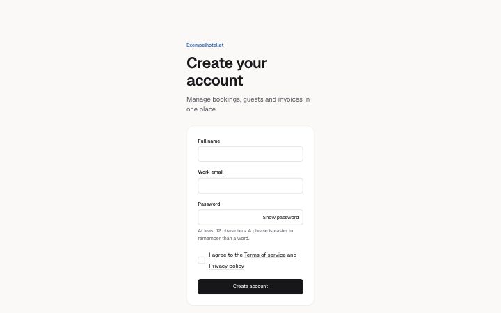
- Create an account: name, email and a password with its rules, a required consent checkbox that names the terms and privacy links, and idle, sending, error and consent-missing states.
- Category
- Interface sections for signed-in products.
Notes
When to use it
Account creation with name, email, a password and a required consent box. For people who already have an account send them to `app-auth-signin`; after signup a code step like `app-auth-code` often follows.
Writing for it
- The consent sentence is built from `before`, a terms link, `and` and a privacy link, with `before` up to 60 characters. Write it so it reads as one sentence when the links are inserted. - `passwordHint` (120) should state the actual rule, such as the minimum length, so no one finds it out from an error. - Fill `messages.consent` (120) with what is missing, for example that the terms must be accepted, since it describes the unticked box in the consent state.
Watch out for
This block is strict: the consent sentence and its two links are never replaced by default text if they are invalid, so an empty terms or privacy label cannot ship. Pressing submit without ticking the box marks it as missing even when `state` is idle.
Pairs well with
Usage
The block in a page, with its default content (long lists shortened). Every prop is in the table below.
import { Theme } from '@/components/klarhimmel/theme/style';
import { BlockSurface } from '@/components/klarhimmel/blocks/surface';
import AppAuthSignup from '@/components/klarhimmel/blocks/app-auth-signup';

export default function Section() {
  return (
    <Theme theme="brand">
      <BlockSurface>
        <AppAuthSignup props={{
          "eyebrow": "Exempelhotellet",
          "title": "Create your account",
          "description": "Manage bookings, guests and invoices in one place.",
          "nameLabel": "Full name",
          "emailLabel": "Work email",
          "passwordLabel": "Password",
          "passwordHint": "At least 12 characters. A phrase is easier to remember than a word.",
          "showLabel": "Show password",
          "hideLabel": "Hide password",
          "consent": {
            "before": "I agree to the",
            "terms": {
              "label": "Terms of service",
              "href": "#terms"
            },
            "and": "and",
            "privacy": {
              "label": "Privacy policy",
              "href": "#privacy"
            }
          },
          "submit": "Create account",
          "sending": "Creating account…",
          "alternative": {
            "text": "Already have an account?",
            "link": {
              "label": "Sign in",
              "href": "#sign-in"
            }
          },
          "state": "idle",
          "messages": {
            "error": "We could not create the account. Check the details and try again.",
            "consent": "Agree to the terms and privacy policy to continue."
          }
        }} />
      </BlockSurface>
    </Theme>
  );
}
Props
The type, default and text limit of every prop. On a real page, over-limit text is kept and checkSections flags it (Installation, Check a page before you ship); this live preview shows the default until it fits. The panel above edits all props.
| Prop | Type | Default | Description |
|---|---|---|---|
eyebrow | string | 'Exempelhotellet' | Text, up to 60 characters. Optional; empty is not rendered. |
title | string | 'Create your account' | Text, up to 120 characters. |
description | string | 'Manage bookings, guests and invoice…' | Text, up to 300 characters. Optional; empty is not rendered. |
nameLabel | string | 'Full name' | Text, up to 40 characters. |
emailLabel | string | 'Work email' | Text, up to 40 characters. |
passwordLabel | string | 'Password' | Text, up to 40 characters. |
passwordHint | string | 'At least 12 characters. A phrase is…' | Text, up to 120 characters. |
showLabel | string | 'Show password' | Text, up to 30 characters. |
hideLabel | string | 'Hide password' | Text, up to 30 characters. |
consent | { before, terms, and, privacy } | {…} | Fields: before, terms, and, privacy. |
submit | string | 'Create account' | Text, up to 30 characters. |
sending | string | 'Creating account…' | Text, up to 30 characters. |
alternative | { text, link } | {…} | Fields: text, link. |
state | 'idle' | 'sending' | 'error' | 'consent' | 'idle' | One of 'idle', 'sending', 'error', 'consent'. |
messages | { error, consent } | {…} | Fields: error, consent. |
action | string | - | Text, up to 300 characters. Optional; empty is not rendered. |
method | 'post' | 'get' | - | One of 'post', 'get'. Optional; empty is not rendered. |
hidden | { } | - | Optional; empty is not rendered. |
captcha | boolean | - | Optional; empty is not rendered. |
captchaSitekey | string | - | Text, up to 100 characters. Optional; empty is not rendered. |
headingLevel | '1' | '2' | - | One of '1', '2'. Optional; empty is not rendered. |