App, one-time code
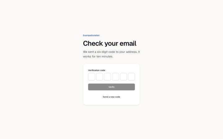
Install
npx shadcn add @klarhimmel/app-auth-codeUsage
import { Theme } from '@/components/klarhimmel/theme/style';
import { BlockSurface } from '@/components/klarhimmel/blocks/surface';
import AppAuthCode from '@/components/klarhimmel/blocks/app-auth-code';

export default function Section() {
  return (
    <Theme theme="brand">
      <BlockSurface>
        <AppAuthCode props={{
          "eyebrow": "Exempelhotellet",
          "title": "Check your email",
          "description": "We sent a six-digit code to your address. It works for ten minutes.",
          "codeLabel": "Verification code",
          "digitLabel": "Digit",
          "of": "of",
          "submit": "Verify",
          "verifying": "Verifying…",
          "resend": "Send a new code",
          "state": "idle",
          "messages": {
            "error": "That code is not right or has expired. Check it or ask for a new one.",
            "resent": "A new code is on its way."
          }
        }} />
      </BlockSurface>
    </Theme>
  );
}
Install
Import
import Block from '@/components/klarhimmel/blocks/app-auth-code';- app/auth-code
- About
- Enter a six-digit code: six boxes that behave as one field. Typing moves forward, Backspace moves back, arrow keys move, pasting fills every box, and the first box asks for the one-time code autofill.
- Category
- Interface sections for signed-in products.
Notes
When to use it
The step after sign-in or sign-up where someone types a six-digit code from an email or text. For choosing a new password use `app-auth-reset`; for the first sign-in step use `app-auth-signin`.
Writing for it
- `codeLabel` (40 characters) names the group of boxes, and each box is read as `digitLabel`, its number, `of` and 6. Keep `digitLabel` to a single word such as Digit. - The `description` (300) is the place to say where the code was sent and how long it lasts; the box count is fixed at six, so do not promise any other length. - Write `messages.error` and `messages.resent` as full sentences up to 120 characters. The resent text appears after someone presses the resend button, even when the state prop is idle.
Watch out for
Nothing is sent unless the host gives the block an `action` or handles the submit, because it behaves as a form with optional method, hidden fields and captcha. While the state is verifying the boxes are read-only, so a stuck verifying state locks people out.
Pairs well with
Usage
The block in a page, with its default content (long lists shortened). Every prop is in the table below.
import { Theme } from '@/components/klarhimmel/theme/style';
import { BlockSurface } from '@/components/klarhimmel/blocks/surface';
import AppAuthCode from '@/components/klarhimmel/blocks/app-auth-code';

export default function Section() {
  return (
    <Theme theme="brand">
      <BlockSurface>
        <AppAuthCode props={{
          "eyebrow": "Exempelhotellet",
          "title": "Check your email",
          "description": "We sent a six-digit code to your address. It works for ten minutes.",
          "codeLabel": "Verification code",
          "digitLabel": "Digit",
          "of": "of",
          "submit": "Verify",
          "verifying": "Verifying…",
          "resend": "Send a new code",
          "state": "idle",
          "messages": {
            "error": "That code is not right or has expired. Check it or ask for a new one.",
            "resent": "A new code is on its way."
          }
        }} />
      </BlockSurface>
    </Theme>
  );
}
Props
The type, default and text limit of every prop. On a real page, over-limit text is kept and checkSections flags it (Installation, Check a page before you ship); this live preview shows the default until it fits. The panel above edits all props.
| Prop | Type | Default | Description |
|---|---|---|---|
eyebrow | string | 'Exempelhotellet' | Text, up to 60 characters. Optional; empty is not rendered. |
title | string | 'Check your email' | Text, up to 120 characters. |
description | string | 'We sent a six-digit code to your ad…' | Text, up to 300 characters. Optional; empty is not rendered. |
codeLabel | string | 'Verification code' | Text, up to 40 characters. |
digitLabel | string | 'Digit' | Text, up to 20 characters. |
of | string | 'of' | Text, up to 10 characters. |
submit | string | 'Verify' | Text, up to 30 characters. |
verifying | string | 'Verifying…' | Text, up to 30 characters. |
resend | string | 'Send a new code' | Text, up to 30 characters. |
state | 'idle' | 'verifying' | 'error' | 'resent' | 'idle' | One of 'idle', 'verifying', 'error', 'resent'. |
messages | { error, resent } | {…} | Fields: error, resent. |
action | string | - | Text, up to 300 characters. Optional; empty is not rendered. |
method | 'post' | 'get' | - | One of 'post', 'get'. Optional; empty is not rendered. |
hidden | { } | - | Optional; empty is not rendered. |
captcha | boolean | - | Optional; empty is not rendered. |
captchaSitekey | string | - | Text, up to 100 characters. Optional; empty is not rendered. |
headingLevel | '1' | '2' | - | One of '1', '2'. Optional; empty is not rendered. |