Footer, centered
Install
npx shadcn add @klarhimmel/footer-centeredUsage
import { Theme } from '@/components/klarhimmel/theme/style';
import { BlockSurface } from '@/components/klarhimmel/blocks/surface';
import FooterCentered from '@/components/klarhimmel/blocks/footer-centered';

export default function Section() {
  return (
    <Theme theme="brand">
      <BlockSurface>
        <FooterCentered props={{
          "brand": "Northlight",
          "tagline": "Booking pages for small hotels.",
          "links": [
            {
              "label": "Product",
              "href": "/product"
            },
            {
              "label": "Pricing",
              "href": "/pricing"
            },
            {
              "label": "Customers",
              "href": "/customers"
            },
            {
              "label": "Help",
              "href": "/help"
            },
            {
              "label": "Contact",
              "href": "/contact"
            }
          ],
          "social": [
            {
              "label": "LinkedIn",
              "href": "https://example.com/linkedin"
            },
            {
              "label": "Instagram",
              "href": "https://example.com/instagram"
            },
            {
              "label": "YouTube",
              "href": "https://example.com/youtube"
            }
          ],
          "legal": "© 2026 Northlight AB. All rights reserved."
        }} />
      </BlockSurface>
    </Theme>
  );
}
Install
Import
import Block from '@/components/klarhimmel/blocks/footer-centered';- footer/centered
- About
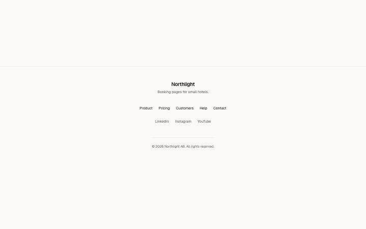
- A centred footer: brand and one-line tagline, a row of page links, a row of social links, then the legal line. For sites with five or six pages and no need for link columns.
- Category
- The end of every page: links, legal, an optional sign-up.
Notes
When to use it
A centred footer with brand, one-line tagline, a row of page links, a row of social links and a legal line. Use it for sites with five or six pages; when you need grouped link columns, `footer-columns` fits better.
Writing for it
- Pick one to six page links and up to four social links. The social row can be left out by deleting every entry. - The tagline holds 160 characters but sits on one centred line, so write what the company does in one plain sentence. - The legal line holds 160 characters and goes under a divider. Put the year and the registered company name there.
Watch out for
A link with an empty label is dropped from the page, so a half-filled link will not show up as a blank tab stop. If both link rows end up empty, the space they used collapses.
Pairs well with
Usage
The block in a page, with its default content (long lists shortened). Every prop is in the table below.
import { Theme } from '@/components/klarhimmel/theme/style';
import { BlockSurface } from '@/components/klarhimmel/blocks/surface';
import FooterCentered from '@/components/klarhimmel/blocks/footer-centered';

export default function Section() {
  return (
    <Theme theme="brand">
      <BlockSurface>
        <FooterCentered props={{
          "brand": "Northlight",
          "tagline": "Booking pages for small hotels.",
          "links": [
            {
              "label": "Product",
              "href": "/product"
            },
            {
              "label": "Pricing",
              "href": "/pricing"
            },
            {
              "label": "Customers",
              "href": "/customers"
            },
            {
              "label": "Help",
              "href": "/help"
            },
            {
              "label": "Contact",
              "href": "/contact"
            }
          ],
          "social": [
            {
              "label": "LinkedIn",
              "href": "https://example.com/linkedin"
            },
            {
              "label": "Instagram",
              "href": "https://example.com/instagram"
            },
            {
              "label": "YouTube",
              "href": "https://example.com/youtube"
            }
          ],
          "legal": "© 2026 Northlight AB. All rights reserved."
        }} />
      </BlockSurface>
    </Theme>
  );
}
Props
The type, default and text limit of every prop. On a real page, over-limit text is kept and checkSections flags it (Installation, Check a page before you ship); this live preview shows the default until it fits. The panel above edits all props.
| Prop | Type | Default | Description |
|---|---|---|---|
brand | string | 'Northlight' | Text, up to 40 characters. |
tagline | string | 'Booking pages for small hotels.' | Text, up to 160 characters. |
links | Link[] | 5 items | List of 1 to 6. |
social | Link[] | 3 items | List of up to 4. |
legal | string | '© 2026 Northlight AB. All rights re…' | Text, up to 160 characters. |