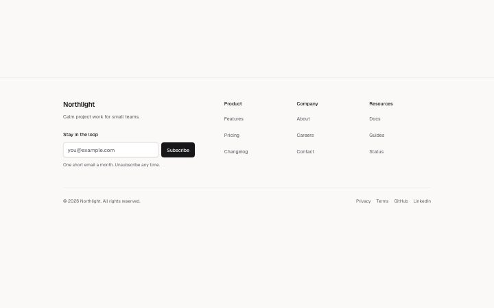
Footer, columns
Install
npx shadcn add @klarhimmel/footer-columnsUsage
import { Theme } from '@/components/klarhimmel/theme/style';
import { BlockSurface } from '@/components/klarhimmel/blocks/surface';
import FooterColumns from '@/components/klarhimmel/blocks/footer-columns';

export default function Section() {
  return (
    <Theme theme="brand">
      <BlockSurface>
        <FooterColumns props={{
          "brand": "Northlight",
          "tagline": "Calm project work for small teams.",
          "columns": [
            {
              "title": "Product",
              "links": [
                {
                  "label": "Features",
                  "href": "#features"
                },
                {
                  "label": "Pricing",
                  "href": "#pricing"
                },
                {
                  "label": "Changelog",
                  "href": "#changelog"
                }
              ]
            },
            {
              "title": "Company",
              "links": [
                {
                  "label": "About",
                  "href": "#about"
                },
                {
                  "label": "Careers",
                  "href": "#careers"
                },
                {
                  "label": "Contact",
                  "href": "#contact"
                }
              ]
            },
            {
              "title": "Resources",
              "links": [
                {
                  "label": "Docs",
                  "href": "#docs"
                },
                {
                  "label": "Guides",
                  "href": "#guides"
                },
                {
                  "label": "Status",
                  "href": "#status"
                }
              ]
            }
          ],
          "legal": "© 2026 Northlight. All rights reserved.",
          "newsletter": {
            "title": "Stay in the loop",
            "placeholder": "you@example.com",
            "submit": "Subscribe",
            "note": "One short email a month. Unsubscribe any time."
          },
          "legalLinks": [
            {
              "label": "Privacy",
              "href": "#privacy"
            },
            {
              "label": "Terms",
              "href": "#terms"
            },
            {
              "label": "GitHub",
              "href": "#github"
            },
            {
              "label": "LinkedIn",
              "href": "#linkedin"
            }
          ]
        }} />
      </BlockSurface>
    </Theme>
  );
}
Install
Import
import Block from '@/components/klarhimmel/blocks/footer-columns';- footer/link-columns
- Category
- The end of every page: links, legal, an optional sign-up.
Notes
When to use it
A full site footer with brand and tagline beside up to four columns of links, an optional newsletter form and a legal row. Use `footer-simple` for a small site, or `footer-cta` when the footer should also carry a final ask.
Writing for it
- Each column has a title of up to 40 characters and up to eight links. Use brandLayout: 'wordmark' for full-width columns followed by one SVG logo row above the legal divider; this removes the brand/tagline column. - The newsletter block is optional. If you include it, the placeholder and submit text are required and the note under it holds 160 characters. - Legal links take up to six items beside the legal text. Privacy and Terms usually go there, and some sites add social links as the default does.
Watch out for
Column titles render as h2 elements, which add to the page outline in every page that uses this footer. The grid sets its width from the number of columns, so with only one or two columns the links bunch up on the left.
Pairs well with
Usage
The block in a page, with its default content (long lists shortened). Every prop is in the table below.
import { Theme } from '@/components/klarhimmel/theme/style';
import { BlockSurface } from '@/components/klarhimmel/blocks/surface';
import FooterColumns from '@/components/klarhimmel/blocks/footer-columns';

export default function Section() {
  return (
    <Theme theme="brand">
      <BlockSurface>
        <FooterColumns props={{
          "brand": "Northlight",
          "tagline": "Calm project work for small teams.",
          "columns": [
            {
              "title": "Product",
              "links": [
                {
                  "label": "Features",
                  "href": "#features"
                },
                {
                  "label": "Pricing",
                  "href": "#pricing"
                }
              ]
            },
            {
              "title": "Company",
              "links": [
                {
                  "label": "About",
                  "href": "#about"
                },
                {
                  "label": "Careers",
                  "href": "#careers"
                }
              ]
            }
          ],
          "legal": "© 2026 Northlight. All rights reserved.",
          "newsletter": {
            "title": "Stay in the loop",
            "placeholder": "you@example.com",
            "submit": "Subscribe",
            "note": "One short email a month. Unsubscribe any time."
          },
          "legalLinks": [
            {
              "label": "Privacy",
              "href": "#privacy"
            },
            {
              "label": "Terms",
              "href": "#terms"
            }
          ]
        }} />
      </BlockSurface>
    </Theme>
  );
}
Props
The type, default and text limit of every prop. On a real page, over-limit text is kept and checkSections flags it (Installation, Check a page before you ship); this live preview shows the default until it fits. The panel above edits all props.
| Prop | Type | Default | Description |
|---|---|---|---|
brand | string | 'Northlight' | Text, up to 40 characters. |
brandLayout | 'column' | 'wordmark' | - | One of 'column', 'wordmark'. Optional; empty is not rendered. |
mark | { paths, viewBox, src } | - | Fields: paths (optional), viewBox (optional), src (optional). Optional; empty is not rendered. |
tagline | string | 'Calm project work for small teams.' | Text, up to 160 characters. |
columns | { title, links }[] | 3 items | List of up to 4. Each item: title, links. |
legal | string | '© 2026 Northlight. All rights reser…' | Text, up to 120 characters. |
newsletter | { title, placeholder, submit, note, action, method, hidden, captcha, captchaSite | {…} | Fields: title (optional), placeholder, submit, note, action (optional), method ('post' | 'get') (optional), hidden (optional), captcha (optional), captchaSitekey (optional). Optional; empty is not rendered. |
legalLinks | Link[] | 4 items | List of up to 6. Optional; empty is not rendered. |