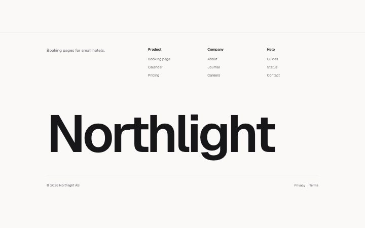
Footer, wordmark
Install
npx shadcn add @klarhimmel/footer-wordmarkUsage
import { Theme } from '@/components/klarhimmel/theme/style';
import { BlockSurface } from '@/components/klarhimmel/blocks/surface';
import FooterWordmark from '@/components/klarhimmel/blocks/footer-wordmark';

export default function Section() {
  return (
    <Theme theme="brand">
      <BlockSurface>
        <FooterWordmark props={{
          "brand": "Northlight",
          "tagline": "Booking pages for small hotels.",
          "columns": [
            {
              "title": "Product",
              "links": [
                {
                  "label": "Booking page",
                  "href": "/product"
                },
                {
                  "label": "Calendar",
                  "href": "/calendar"
                },
                {
                  "label": "Pricing",
                  "href": "/pricing"
                }
              ]
            },
            {
              "title": "Company",
              "links": [
                {
                  "label": "About",
                  "href": "/about"
                },
                {
                  "label": "Journal",
                  "href": "/journal"
                },
                {
                  "label": "Careers",
                  "href": "/careers"
                }
              ]
            },
            {
              "title": "Help",
              "links": [
                {
                  "label": "Guides",
                  "href": "/help"
                },
                {
                  "label": "Status",
                  "href": "/status"
                },
                {
                  "label": "Contact",
                  "href": "/contact"
                }
              ]
            }
          ],
          "legal": "© 2026 Northlight AB",
          "legalLinks": [
            {
              "label": "Privacy",
              "href": "/privacy"
            },
            {
              "label": "Terms",
              "href": "/terms"
            }
          ]
        }} />
      </BlockSurface>
    </Theme>
  );
}
Install
Import
import Block from '@/components/klarhimmel/blocks/footer-wordmark';- footer/wordmark
- About
- A footer led by an SVG text wordmark that scales to the full container width without wrapping or cropping, with up to three short link columns above and a legal row. Brand names up to 16 characters.
- Category
- The end of every page: links, legal, an optional sign-up.
Notes
When to use it
A footer ending in the brand name set very large across the bottom, with up to three short link columns and a legal row above. For longer names or many links, use `footer-columns`.
Writing for it
- The brand is limited to 16 characters. Its SVG text wordmark scales to the full container width, including short names. - Use one to three columns with a title of up to 30 characters and one to five links each. Keep labels to one or two words. - The tagline (120 characters) sits top left beside the columns. Write one sentence about what the company does.
Watch out for
The wordmark uses the page's display font and fits its glyphs to the SVG width. Check the proportions of unusually short or wide names in the preview. Legal links take at most three entries.
Pairs well with
Usage
The block in a page, with its default content (long lists shortened). Every prop is in the table below.
import { Theme } from '@/components/klarhimmel/theme/style';
import { BlockSurface } from '@/components/klarhimmel/blocks/surface';
import FooterWordmark from '@/components/klarhimmel/blocks/footer-wordmark';

export default function Section() {
  return (
    <Theme theme="brand">
      <BlockSurface>
        <FooterWordmark props={{
          "brand": "Northlight",
          "tagline": "Booking pages for small hotels.",
          "columns": [
            {
              "title": "Product",
              "links": [
                {
                  "label": "Booking page",
                  "href": "/product"
                },
                {
                  "label": "Calendar",
                  "href": "/calendar"
                }
              ]
            },
            {
              "title": "Company",
              "links": [
                {
                  "label": "About",
                  "href": "/about"
                },
                {
                  "label": "Journal",
                  "href": "/journal"
                }
              ]
            }
          ],
          "legal": "© 2026 Northlight AB",
          "legalLinks": [
            {
              "label": "Privacy",
              "href": "/privacy"
            },
            {
              "label": "Terms",
              "href": "/terms"
            }
          ]
        }} />
      </BlockSurface>
    </Theme>
  );
}
Props
The type, default and text limit of every prop. On a real page, over-limit text is kept and checkSections flags it (Installation, Check a page before you ship); this live preview shows the default until it fits. The panel above edits all props.
| Prop | Type | Default | Description |
|---|---|---|---|
brand | string | 'Northlight' | Text, up to 16 characters. |
tagline | string | 'Booking pages for small hotels.' | Text, up to 120 characters. |
columns | { title, links }[] | 3 items | List of 1 to 3. Each item: title, links. |
legal | string | '© 2026 Northlight AB' | Text, up to 120 characters. |
legalLinks | Link[] | 2 items | List of up to 3. |