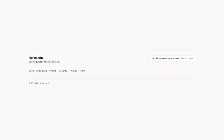
Footer, with system status
Install
npx shadcn add @klarhimmel/footer-statusUsage
import { Theme } from '@/components/klarhimmel/theme/style';
import { BlockSurface } from '@/components/klarhimmel/blocks/surface';
import FooterStatus from '@/components/klarhimmel/blocks/footer-status';

export default function Section() {
  return (
    <Theme theme="brand">
      <BlockSurface>
        <FooterStatus props={{
          "brand": "Northlight",
          "tagline": "Booking pages for small hotels.",
          "statusTone": "ok",
          "status": "All systems operational",
          "statusLink": {
            "label": "Status page",
            "href": "#status"
          },
          "links": [
            {
              "label": "Docs",
              "href": "#docs"
            },
            {
              "label": "Changelog",
              "href": "#changelog"
            },
            {
              "label": "Pricing",
              "href": "#pricing"
            },
            {
              "label": "Security",
              "href": "#security"
            },
            {
              "label": "Privacy",
              "href": "#privacy"
            },
            {
              "label": "Terms",
              "href": "#terms"
            }
          ],
          "legal": "© 2026 Northlight AB"
        }} />
      </BlockSurface>
    </Theme>
  );
}
Install
Import
import Block from '@/components/klarhimmel/blocks/footer-status';- footer/status
- About
- A compact footer for a product: brand and tagline, a status pill (a dot, the words "All systems operational" and a link to the status page), one wrapped row of links and the legal line. The dot is shown by shape as well as colour.
- Category
- The end of every page: links, legal, an optional sign-up.
Notes
When to use it
A compact product footer with brand, tagline, a status pill, one wrapped row of links and a legal line. Use it for software with a public status page; `footer-simple` is the same size without the status.
Writing for it
- Choose statusTone ok, degraded or down. The tone picks the icon, a check, a triangle or a cross, so it reads without colour. - Write status (required, 60 characters) in your own words, such as 'All systems operational', and point statusLink at the real status page. - Add two to eight links in one row. There are no columns, so keep to the most visited pages.
Watch out for
The tone and the words are set by hand and do not read from any live service, so a status of 'All systems operational' stays on screen during an outage unless someone edits the block. Only a host that feeds the block can keep it true.
Usage
The block in a page, with its default content (long lists shortened). Every prop is in the table below.
import { Theme } from '@/components/klarhimmel/theme/style';
import { BlockSurface } from '@/components/klarhimmel/blocks/surface';
import FooterStatus from '@/components/klarhimmel/blocks/footer-status';

export default function Section() {
  return (
    <Theme theme="brand">
      <BlockSurface>
        <FooterStatus props={{
          "brand": "Northlight",
          "tagline": "Booking pages for small hotels.",
          "statusTone": "ok",
          "status": "All systems operational",
          "statusLink": {
            "label": "Status page",
            "href": "#status"
          },
          "links": [
            {
              "label": "Docs",
              "href": "#docs"
            },
            {
              "label": "Changelog",
              "href": "#changelog"
            },
            {
              "label": "Pricing",
              "href": "#pricing"
            },
            {
              "label": "Security",
              "href": "#security"
            },
            {
              "label": "Privacy",
              "href": "#privacy"
            },
            {
              "label": "Terms",
              "href": "#terms"
            }
          ],
          "legal": "© 2026 Northlight AB"
        }} />
      </BlockSurface>
    </Theme>
  );
}
Props
The type, default and text limit of every prop. On a real page, over-limit text is kept and checkSections flags it (Installation, Check a page before you ship); this live preview shows the default until it fits. The panel above edits all props.
| Prop | Type | Default | Description |
|---|---|---|---|
brand | string | 'Northlight' | Text, up to 40 characters. |
tagline | string | 'Booking pages for small hotels.' | Text, up to 120 characters. |
statusTone | 'ok' | 'degraded' | 'down' | 'ok' | One of 'ok', 'degraded', 'down'. |
status | string | 'All systems operational' | Text, up to 60 characters. |
statusLink | Link | {…} | See the type. |
links | Link[] | 6 items | List of 2 to 8. |
legal | string | '© 2026 Northlight AB' | Text, up to 120 characters. |