Contact, booking
Install
npx shadcn add @klarhimmel/contact-bookingUsage
import { Theme } from '@/components/klarhimmel/theme/style';
import { BlockSurface } from '@/components/klarhimmel/blocks/surface';
import ContactBooking from '@/components/klarhimmel/blocks/contact-booking';

export default function Section() {
  return (
    <Theme theme="brand">
      <BlockSurface>
        <ContactBooking props={{
          "eyebrow": "Talk to us",
          "title": "Book a short call",
          "description": "Twenty minutes to see if Northlight fits your team. Pick a time, or reach us another way.",
          "options": [
            {
              "label": "Email",
              "description": "hello@northlight.example. We reply within a working day.",
              "link": {
                "label": "Send an email",
                "href": "mailto:hello@northlight.example"
              }
            },
            {
              "label": "Help centre",
              "description": "Guides for setup, planning and the weekly review.",
              "link": {
                "label": "Browse guides",
                "href": "#help"
              }
            }
          ],
          "slotsTitle": "Pick a time",
          "slots": [
            "Tue 09:30",
            "Tue 14:00",
            "Wed 11:00",
            "Wed 15:30",
            "Thu 10:00",
            "Thu 13:30"
          ],
          "submit": "Confirm booking"
        }} />
      </BlockSurface>
    </Theme>
  );
}
Install
Import
import Block from '@/components/klarhimmel/blocks/contact-booking';- contact/booking
- Category
- A form, a booking panel or office details. The page wires the submit.
Notes
When to use it
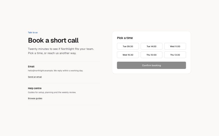
Contact options on the left and a card of fixed time slots with a confirm button on the right. The slots are static text you write; for a real calendar use `contact-booking-link` instead.
Writing for it
- Slots take one to eight entries of up to 30 characters, such as 'Tue 10:00'. Write them in one consistent format so the grid of buttons lines up. - Options (one to three) each have a label (40), a description (140) and a link. Use them for the other ways in, such as a phone line for people who dislike forms. - The slotsTitle (60) is the legend of the radio group. Phrase it as a question, like 'When suits you?'.
Watch out for
Confirm stays disabled until a slot is picked, and the choice is only a radio value named 'slot'; the block checks no availability, so expired slots must be removed by hand. A host has to wire the submit.
Pairs well with
Usage
The block in a page, with its default content (long lists shortened). Every prop is in the table below.
import { Theme } from '@/components/klarhimmel/theme/style';
import { BlockSurface } from '@/components/klarhimmel/blocks/surface';
import ContactBooking from '@/components/klarhimmel/blocks/contact-booking';

export default function Section() {
  return (
    <Theme theme="brand">
      <BlockSurface>
        <ContactBooking props={{
          "eyebrow": "Talk to us",
          "title": "Book a short call",
          "description": "Twenty minutes to see if Northlight fits your team. Pick a time, or reach us another way.",
          "options": [
            {
              "label": "Email",
              "description": "hello@northlight.example. We reply within a working day.",
              "link": {
                "label": "Send an email",
                "href": "mailto:hello@northlight.example"
              }
            },
            {
              "label": "Help centre",
              "description": "Guides for setup, planning and the weekly review.",
              "link": {
                "label": "Browse guides",
                "href": "#help"
              }
            }
          ],
          "slotsTitle": "Pick a time",
          "slots": [
            "Tue 09:30",
            "Tue 14:00",
            "Wed 11:00",
            "Wed 15:30",
            "Thu 10:00",
            "Thu 13:30"
          ],
          "submit": "Confirm booking"
        }} />
      </BlockSurface>
    </Theme>
  );
}
Props
The type, default and text limit of every prop. On a real page, over-limit text is kept and checkSections flags it (Installation, Check a page before you ship); this live preview shows the default until it fits. The panel above edits all props.
| Prop | Type | Default | Description |
|---|---|---|---|
eyebrow | string | 'Talk to us' | Text, up to 60 characters. |
title | string | 'Book a short call' | Text, up to 120 characters. |
description | string | 'Twenty minutes to see if Northlight…' | Text, up to 300 characters. |
options | { label, description, link }[] | 2 items | List of 1 to 3. Each item: label, description, link. |
slotsTitle | string | 'Pick a time' | Text, up to 60 characters. |
slots | string[] | 6 items | List of 1 to 8. |
submit | string | 'Confirm booking' | Text, up to 30 characters. |
action | string | - | Text, up to 300 characters. Optional; empty is not rendered. |
method | 'post' | 'get' | - | One of 'post', 'get'. Optional; empty is not rendered. |
hidden | { } | - | Optional; empty is not rendered. |
captcha | boolean | - | Optional; empty is not rendered. |
captchaSitekey | string | - | Text, up to 100 characters. Optional; empty is not rendered. |
headingLevel | '1' | '2' | - | One of '1', '2'. Optional; empty is not rendered. |