Contact, offices
Install
npx shadcn add @klarhimmel/contact-officesUsage
import { Theme } from '@/components/klarhimmel/theme/style';
import { BlockSurface } from '@/components/klarhimmel/blocks/surface';
import ContactOffices from '@/components/klarhimmel/blocks/contact-offices';

export default function Section() {
  return (
    <Theme theme="brand">
      <BlockSurface>
        <ContactOffices props={{
          "eyebrow": "Contact",
          "title": "Come by, call, or write",
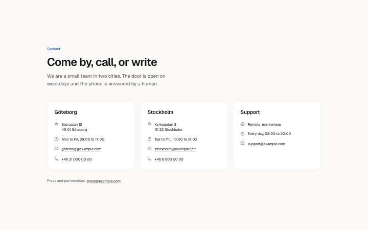
          "description": "We are a small team in two cities. The door is open on weekdays and the phone is answered by a human.",
          "offices": [
            {
              "city": "Göteborg",
              "address": "Storgatan 12\n411 01 Göteborg",
              "hours": "Mon to Fri, 09:00 to 17:00",
              "email": "goteborg@example.com",
              "phone": "+46 31 000 00 00"
            },
            {
              "city": "Stockholm",
              "address": "Kyrkogatan 3\n111 22 Stockholm",
              "hours": "Tue to Thu, 10:00 to 16:00",
              "email": "stockholm@example.com",
              "phone": "+46 8 000 00 00"
            },
            {
              "city": "Support",
              "address": "Remote, everywhere",
              "hours": "Every day, 08:00 to 20:00",
              "email": "support@example.com",
              "phone": ""
            }
          ],
          "note": "Press and partnerships: press@example.com"
        }} />
      </BlockSurface>
    </Theme>
  );
}
Install
Import
import Block from '@/components/klarhimmel/blocks/contact-offices';- contact/offices
- Category
- A form, a booking panel or office details. The page wires the submit.
Notes
When to use it
Where to find us: one card per office with address, hours, email and phone, one to four of them, no form. For a single place with a map, use `contact-map`.
Writing for it
- The city (40) is the card heading. Use the place name people know, such as 'Gothenburg', rather than a street. - An address that contains remote, online, everywhere or distans gets a globe icon instead of a pin, so a remote office can use the same card. - Fill the note (160) with a sentence that includes an email or phone number; the block turns those into links by itself.
Watch out for
Hours, email and phone each drop their line when empty, but the address line always stays, even if blank. The note is only linkified outside the editor, so a pasted number can look unlinked while editing.
Pairs well with
Usage
The block in a page, with its default content (long lists shortened). Every prop is in the table below.
import { Theme } from '@/components/klarhimmel/theme/style';
import { BlockSurface } from '@/components/klarhimmel/blocks/surface';
import ContactOffices from '@/components/klarhimmel/blocks/contact-offices';

export default function Section() {
  return (
    <Theme theme="brand">
      <BlockSurface>
        <ContactOffices props={{
          "eyebrow": "Contact",
          "title": "Come by, call, or write",
          "description": "We are a small team in two cities. The door is open on weekdays and the phone is answered by a human.",
          "offices": [
            {
              "city": "Göteborg",
              "address": "Storgatan 12\n411 01 Göteborg",
              "hours": "Mon to Fri, 09:00 to 17:00",
              "email": "goteborg@example.com",
              "phone": "+46 31 000 00 00"
            },
            {
              "city": "Stockholm",
              "address": "Kyrkogatan 3\n111 22 Stockholm",
              "hours": "Tue to Thu, 10:00 to 16:00",
              "email": "stockholm@example.com",
              "phone": "+46 8 000 00 00"
            },
            {
              "city": "Support",
              "address": "Remote, everywhere",
              "hours": "Every day, 08:00 to 20:00",
              "email": "support@example.com",
              "phone": ""
            }
          ],
          "note": "Press and partnerships: press@example.com"
        }} />
      </BlockSurface>
    </Theme>
  );
}
Props
The type, default and text limit of every prop. On a real page, over-limit text is kept and checkSections flags it (Installation, Check a page before you ship); this live preview shows the default until it fits. The panel above edits all props.
| Prop | Type | Default | Description |
|---|---|---|---|
eyebrow | string | 'Contact' | Text, up to 60 characters. |
title | string | 'Come by, call, or write' | Text, up to 120 characters. |
description | string | 'We are a small team in two cities. …' | Text, up to 300 characters. |
offices | { city, address, hours, email, phone }[] | 3 items | List of 1 to 4. Each item: city, address, hours, email, phone. |
note | string | 'Press and partnerships: press@examp…' | Text, up to 160 characters. |
headingLevel | '1' | '2' | - | One of '1', '2'. Optional; empty is not rendered. |