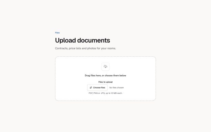
App, upload drop zone
Install
npx shadcn add @klarhimmel/app-files-dropzoneUsage
import { Theme } from '@/components/klarhimmel/theme/style';
import { BlockSurface } from '@/components/klarhimmel/blocks/surface';
import AppFilesDropzone from '@/components/klarhimmel/blocks/app-files-dropzone';

export default function Section() {
  return (
    <Theme theme="brand">
      <BlockSurface>
        <AppFilesDropzone props={{
          "eyebrow": "Files",
          "title": "Upload documents",
          "description": "Contracts, price lists and photos for your rooms.",
          "prompt": "Drag files here, or choose them below",
          "field": {
            "label": "Files to upload",
            "button": "Choose files",
            "empty": "No files chosen",
            "hint": "PDF, PNG or JPG, up to 10 MB each."
          },
          "state": "idle",
          "messages": {
            "dragging": "Drop the files to upload them",
            "error": "One file is larger than 10 MB. Choose a smaller one.",
            "added": "Files added"
          }
        }} />
      </BlockSurface>
    </Theme>
  );
}
Install
Import
import Block from '@/components/klarhimmel/blocks/app-files-dropzone';- app/files-dropzone
- About
- A drop zone that takes a real drop (it highlights while a file is over it, a drop never navigates the page, dropped names are listed and announced) with the file picker inside it, so dragging is never the only way in.
- Category
- Interface sections for signed-in products.
Notes
When to use it
The place where a person adds files to an account or a record, with a real drop target and a file picker inside it. Use `app-files-list` after it to show what was sent and how far each upload has got; this block only lists the names just added.
Writing for it
- The prompt line inside the zone holds 80 characters. Say what to drag and offer the picker in the same breath, since the button sits right below it. - Put the real limits in field.hint (120 characters): accepted formats and the size cap. The error message (120) should repeat that same limit so the two never disagree. - messages.dragging is 60 characters and replaces the prompt while a file hovers, so write it as an instruction about the drop, not a second description.
Watch out for
The state field only sets where the zone starts. A real drag sets the highlight on its own, and the added-files line appears only after someone drops or chooses files, so a static preview of that line needs a live interaction.
Usage
The block in a page, with its default content (long lists shortened). Every prop is in the table below.
import { Theme } from '@/components/klarhimmel/theme/style';
import { BlockSurface } from '@/components/klarhimmel/blocks/surface';
import AppFilesDropzone from '@/components/klarhimmel/blocks/app-files-dropzone';

export default function Section() {
  return (
    <Theme theme="brand">
      <BlockSurface>
        <AppFilesDropzone props={{
          "eyebrow": "Files",
          "title": "Upload documents",
          "description": "Contracts, price lists and photos for your rooms.",
          "prompt": "Drag files here, or choose them below",
          "field": {
            "label": "Files to upload",
            "button": "Choose files",
            "empty": "No files chosen",
            "hint": "PDF, PNG or JPG, up to 10 MB each."
          },
          "state": "idle",
          "messages": {
            "dragging": "Drop the files to upload them",
            "error": "One file is larger than 10 MB. Choose a smaller one.",
            "added": "Files added"
          }
        }} />
      </BlockSurface>
    </Theme>
  );
}
Props
The type, default and text limit of every prop. On a real page, over-limit text is kept and checkSections flags it (Installation, Check a page before you ship); this live preview shows the default until it fits. The panel above edits all props.
| Prop | Type | Default | Description |
|---|---|---|---|
eyebrow | string | 'Files' | Text, up to 60 characters. Optional; empty is not rendered. |
title | string | 'Upload documents' | Text, up to 120 characters. |
description | string | 'Contracts, price lists and photos f…' | Text, up to 300 characters. Optional; empty is not rendered. |
prompt | string | 'Drag files here, or choose them bel…' | Text, up to 80 characters. |
field | { label, button, empty, hint } | {…} | Fields: label, button, empty, hint. |
state | 'idle' | 'dragging' | 'error' | 'idle' | One of 'idle', 'dragging', 'error'. |
messages | { dragging, error, added } | {…} | Fields: dragging, error, added. |
headingLevel | '1' | '2' | - | One of '1', '2'. Optional; empty is not rendered. |