App, setup checklist
Install
npx shadcn add @klarhimmel/app-onboarding-checklistUsage
import { Theme } from '@/components/klarhimmel/theme/style';
import { BlockSurface } from '@/components/klarhimmel/blocks/surface';
import AppOnboardingChecklist from '@/components/klarhimmel/blocks/app-onboarding-checklist';

export default function Section() {
  return (
    <Theme theme="brand">
      <BlockSurface>
        <AppOnboardingChecklist props={{
          "eyebrow": "Get started",
          "title": "Set up Exempelhotellet",
          "description": "Four steps and guests can book. You can come back to this list at any time.",
          "progress": {
            "label": "Setup progress",
            "of": "of",
            "suffix": "steps done"
          },
          "items": [
            {
              "title": "Add your first room",
              "description": "A name, a photo and a price per night.",
              "done": true
            },
            {
              "title": "Set your opening dates",
              "description": "Choose the weeks guests can book.",
              "done": true,
              "action": "Open calendar"
            },
            {
              "title": "Connect payments",
              "description": "So a booking can be paid for when it is made.",
              "done": false,
              "action": "Connect"
            },
            {
              "title": "Publish the booking page",
              "description": "Share one link, or put it on your own site.",
              "done": false
            }
          ],
          "complete": "Everything is set up. Guests can book now."
        }} />
      </BlockSurface>
    </Theme>
  );
}
Install
Import
import Block from '@/components/klarhimmel/blocks/app-onboarding-checklist';- app/onboarding-checklist
- About
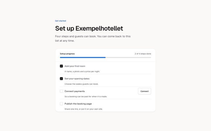
- A getting-started checklist with a progress bar and a count that follow the checkboxes. Each step has a title, a line of help and maybe one action.
- Category
- Interface sections for signed-in products.
Notes
When to use it
A getting-started list for a new account, where each step is ticked in place and a bar shows progress. If the steps must happen in order with one shown at a time, `app-onboarding-steps` fits better; this one lets people do the steps in any order.
Writing for it
- Step titles hold 80 characters and descriptions 160. Start the title with a verb so the tick reads as a finished task. - The progress line is built from the count, progress.of and progress.suffix, as in '2 of 4 steps done'. Write the two small words so that sentence is grammatical in your language. - Use action (30) only on steps that need a button, and keep it to a verb phrase like Connect. Seven items is the cap, and two the minimum.
Watch out for
The action button of a step is hidden once that step is done, so a finished step cannot be reopened from it. The completion message (120) shows above the list only when every box is ticked, and the list stays so a step can be unticked.
Usage
The block in a page, with its default content (long lists shortened). Every prop is in the table below.
import { Theme } from '@/components/klarhimmel/theme/style';
import { BlockSurface } from '@/components/klarhimmel/blocks/surface';
import AppOnboardingChecklist from '@/components/klarhimmel/blocks/app-onboarding-checklist';

export default function Section() {
  return (
    <Theme theme="brand">
      <BlockSurface>
        <AppOnboardingChecklist props={{
          "eyebrow": "Get started",
          "title": "Set up Exempelhotellet",
          "description": "Four steps and guests can book. You can come back to this list at any time.",
          "progress": {
            "label": "Setup progress",
            "of": "of",
            "suffix": "steps done"
          },
          "items": [
            {
              "title": "Add your first room",
              "description": "A name, a photo and a price per night.",
              "done": true
            },
            {
              "title": "Set your opening dates",
              "description": "Choose the weeks guests can book.",
              "done": true,
              "action": "Open calendar"
            },
            {
              "title": "Connect payments",
              "description": "So a booking can be paid for when it is made.",
              "done": false,
              "action": "Connect"
            },
            {
              "title": "Publish the booking page",
              "description": "Share one link, or put it on your own site.",
              "done": false
            }
          ],
          "complete": "Everything is set up. Guests can book now."
        }} />
      </BlockSurface>
    </Theme>
  );
}
Props
The type, default and text limit of every prop. On a real page, over-limit text is kept and checkSections flags it (Installation, Check a page before you ship); this live preview shows the default until it fits. The panel above edits all props.
| Prop | Type | Default | Description |
|---|---|---|---|
eyebrow | string | 'Get started' | Text, up to 60 characters. Optional; empty is not rendered. |
title | string | 'Set up Exempelhotellet' | Text, up to 120 characters. |
description | string | 'Four steps and guests can book. You…' | Text, up to 300 characters. Optional; empty is not rendered. |
progress | { label, of, suffix } | {…} | Fields: label, of, suffix. |
items | { title, description, done, action }[] | 4 items | List of 2 to 7. Each item: title, description, done, action (optional). |
complete | string | 'Everything is set up. Guests can bo…' | Text, up to 120 characters. |
headingLevel | '1' | '2' | - | One of '1', '2'. Optional; empty is not rendered. |