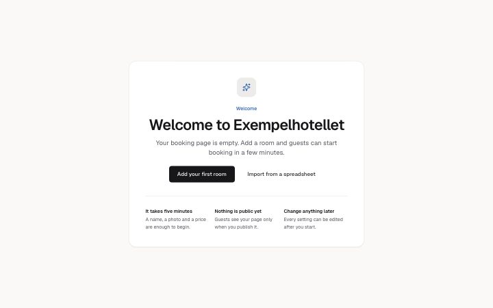
App, welcome screen
Install
npx shadcn add @klarhimmel/app-onboarding-welcomeUsage
import { Theme } from '@/components/klarhimmel/theme/style';
import { BlockSurface } from '@/components/klarhimmel/blocks/surface';
import AppOnboardingWelcome from '@/components/klarhimmel/blocks/app-onboarding-welcome';

export default function Section() {
  return (
    <Theme theme="brand">
      <BlockSurface>
        <AppOnboardingWelcome props={{
          "eyebrow": "Welcome",
          "title": "Welcome to Exempelhotellet",
          "description": "Your booking page is empty. Add a room and guests can start booking in a few minutes.",
          "primary": {
            "label": "Add your first room",
            "href": "#add-room"
          },
          "secondary": {
            "label": "Import from a spreadsheet",
            "href": "#import"
          },
          "tips": [
            {
              "title": "It takes five minutes",
              "description": "A name, a photo and a price are enough to begin."
            },
            {
              "title": "Nothing is public yet",
              "description": "Guests see your page only when you publish it."
            },
            {
              "title": "Change anything later",
              "description": "Every setting can be edited after you start."
            }
          ]
        }} />
      </BlockSurface>
    </Theme>
  );
}
Install
Import
import Block from '@/components/klarhimmel/blocks/app-onboarding-welcome';- app/onboarding-welcome
- About
- The first screen of an empty account: a greeting, one sentence on what happens next, one primary action, an optional secondary link, and two to four short tips. Built so there is exactly one obvious next step.
- Category
- Interface sections for signed-in products.
Notes
When to use it
The first screen of an account with nothing in it yet, built to give exactly one next action. Follow it with `app-onboarding-checklist` once the person has started; use `hero-prompt` or a page hero for marketing pages, not this block.
Writing for it
- The title is required and holds 120 characters. Greet by name of the product or the person, then let the description (300) say what happens next in one sentence. - Both tips fields are short: the tip title holds 50 characters and its line 120. Use them to remove worries, such as what is public and what can be changed later. - primary is a link with a label and an href, so point it at the single action that fills the empty account. The secondary link is optional and should be a smaller alternative, like importing data.
Watch out for
It needs 2 to 4 tips, so a welcome screen with a single tip does not validate. The title renders as an h2, so place it under an existing h1 for the app page rather than expecting it to be the page heading.
Pairs well with
Usage
The block in a page, with its default content (long lists shortened). Every prop is in the table below.
import { Theme } from '@/components/klarhimmel/theme/style';
import { BlockSurface } from '@/components/klarhimmel/blocks/surface';
import AppOnboardingWelcome from '@/components/klarhimmel/blocks/app-onboarding-welcome';

export default function Section() {
  return (
    <Theme theme="brand">
      <BlockSurface>
        <AppOnboardingWelcome props={{
          "eyebrow": "Welcome",
          "title": "Welcome to Exempelhotellet",
          "description": "Your booking page is empty. Add a room and guests can start booking in a few minutes.",
          "primary": {
            "label": "Add your first room",
            "href": "#add-room"
          },
          "secondary": {
            "label": "Import from a spreadsheet",
            "href": "#import"
          },
          "tips": [
            {
              "title": "It takes five minutes",
              "description": "A name, a photo and a price are enough to begin."
            },
            {
              "title": "Nothing is public yet",
              "description": "Guests see your page only when you publish it."
            },
            {
              "title": "Change anything later",
              "description": "Every setting can be edited after you start."
            }
          ]
        }} />
      </BlockSurface>
    </Theme>
  );
}
Props
The type, default and text limit of every prop. On a real page, over-limit text is kept and checkSections flags it (Installation, Check a page before you ship); this live preview shows the default until it fits. The panel above edits all props.
| Prop | Type | Default | Description |
|---|---|---|---|
eyebrow | string | 'Welcome' | Text, up to 60 characters. Optional; empty is not rendered. |
title | string | 'Welcome to Exempelhotellet' | Text, up to 120 characters. |
description | string | 'Your booking page is empty. Add a r…' | Text, up to 300 characters. |
primary | Link | {…} | See the type. |
secondary | Link | {…} | Optional; empty is not rendered. |
tips | { title, description }[] | 3 items | List of 2 to 4. Each item: title, description. |
headingLevel | '1' | '2' | - | One of '1', '2'. Optional; empty is not rendered. |